Acronyms and Akureyri

I just spent four days at a workshop in Northern Iceland. The meeting was based at the secretariat of the International Arctic Science Committee (IASC; acronym #1) in Akureyri. Turns out Akureyri is spookily like a smaller Tromso! I’ll get to the reason that I was there in a bit - but at the very root is being an IASC fellow this year. If you want to know a more about that, you can read my blog post about the Arctic Science Summit Week (ASSW, acronym #2) in Scotland.

As part of my IASC fellowship I wandered into the world of ICARP: the International Conference on Arctic Research Planning (acronym #3). ICARP is more than a research conference where you show up and stand next to a poster looking dorky. It’s a decade-long process where Arctic scientists get together and figure out what we need to know about the Arctic, and how we’re going to find it out. The fourth iteration of ICARP has its summit in Boulder Colorado next year, and I’ll be attending with my IASC fellow hat on, but also my cochair hat for one of ICARP’s seven Research Priority Teams (RPTs; acronym #4). 

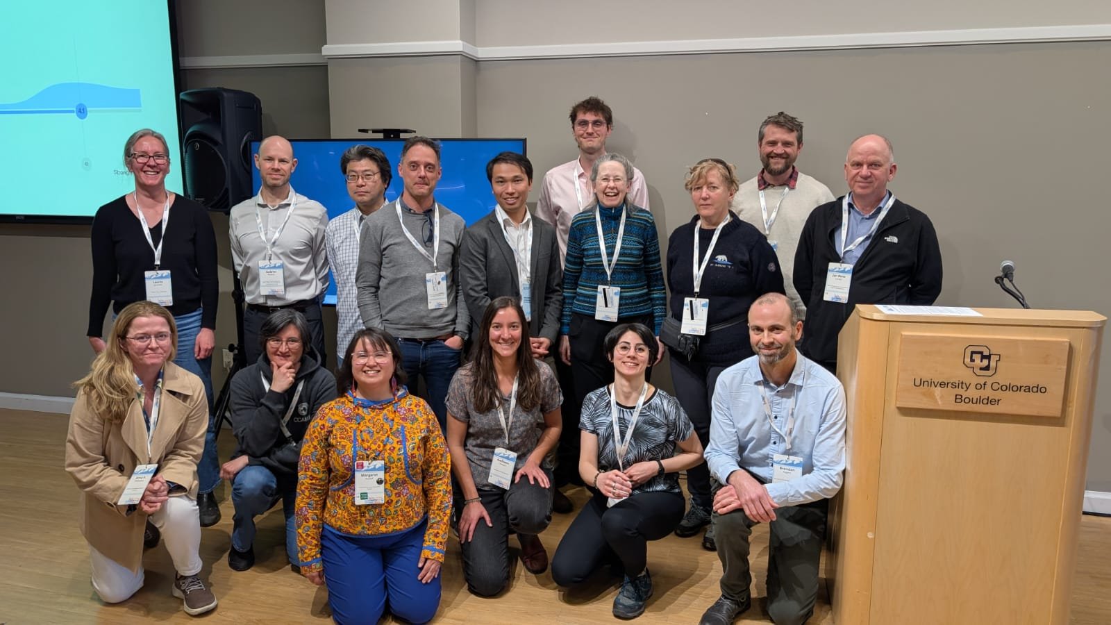
Having had our first meeting in Edinburgh in March of this year, all my RPT-related work has been remote. That changed with this meeting, where co-chairs of the RPTs were invited to come to Akureyri and thrash out some details. Being in the zoom is good, but being in the room is better. While communication within individual research priority teams has generally been good, communication between RPTs has been less effective. So we all showed up to discuss the overlaps between our respective teams’ remits, gaps between the remits, procedural issues, and how we’re actually going to report our findings. It was also a great chance for RPT cochairs to chat with the ICARP steering committee, which plays a big role in synthesising the final ICARP report from the individual reports by the RPTs. 

I felt like we made progress on the above technical issues, but more importantly I left Iceland with a much greater large-scale understanding of the ICARP process. Just selfishly, the meeting was also a great networking opportunity for me: there are a lot of senior scientists involved and it was useful to chat with them in an informal setting; there’s also a strong contingent of ECRs who are generally a fascinating bunch. Even more selfishly, I had a great time hanging out with everyone in the evenings! I came back super motivated.

Above: Talking shop in a geothermally heated hot-tub with Kabir Raouli (2022 IASC fellow), standing in a rock arch (both taken by Lisa Winberg von Friesen - 2023 fellow). Final photo is of a geothermal area we visited on the final afternoon.

IASC paid for me to attend this meeting - flights, hotel, per diem. After ASSW in Boulder I’ll no longer receive this level of funding support, so I’m very grateful to have it while it lasts! I view these IASC/ICARP activities as deep, slow-payoff, long-term investments in my academic future. Sometimes it feels like investing like that is a gamble: shouldn’t I just be writing code and churning out loads of papers? Perhaps - but I really like the IASC/ICARP stuff, and it truly refreshes my analytical brain to discuss these big-picture topics.

Peer review: on deficiencies, publisher-pays, and my track record

Why peer review is bad

Peer review is much maligned, and I’ll start this blog by reminding you why. Firstly, it’s very imprecise in the sense that multiple reviewers can have quite different views on the same manuscript, even when using the same assessment rubric. But that rubric is also often unclear, with some reviewers simply assessing rigor and others going further and assessing potential “impact” and editorial worthiness.

Scale diagram of scientific literature pipeline with peer reviewers pictured standing in foreground.

Peer review can also be very political – a paper that supports your scientific worldview might get a softer, friendlier treatment than one which casts doubt on your life’s work. This can be subconscious or entirely deliberate. I’ve recently heard about a phenomenon of “networking” through review, where early and mid-career scientists give big-name authors soft, signed reviews in the hope that the author might reach out for their next grant proposal or similar. It’s also getting more and more difficult to get peer reviewers as the number of publications per year per scientist goes up, and as a result the quality of reviews is going down (see this very interesting AGU editorial on the subject).

So grim stuff all round with regard to peer review. But some scientists say that we can improve things by making publishers pay us - I’ll address that first, before reflecting on my own reviewing behaviour.

Why publishers shouldn’t pay me for peer review (but I get paid for it anyway)

The most common criticism of peer review that I hear is “we do it for free”. This is often followed with reference to profit-making publishers with big margins (looking at you Elsevier). Many think that their lucrative business model is predicated on not paying scientists for their services, and I think that’s probably true. But here is a brief critique of “publisher pays”. Once I’ve made it, I’ll reflect on my own reviewing activities, which is something I think we should all be more transparent about.

My premise is that peer review is part of my/your job as a scientist, for which you and I are paid! In my mind, we are therefore paid to do peer review. I work about 45 hours per week in my job at UiT, and I get paid a salary to do that. My contract says that my role is full-time “research and development”, and I think it’s a fairly straightforward argument that peer review activity is part of the R&D process that I get paid to do that. If you’re a PhD student, it’s should definitely also be part of your research process, and if you’re a professor it should be part of yours too. I think that if you’re paid to do research, you’re paid to do peer review. In fact, if I were to be paid for peer review by publishers, then I would be getting paid twice for the same work, which is a bit... dubious.

Some people seem to imply that because peer-review is not mentioned specifically in my contract, then I’m essentially doing it for free. This argument doesn’t wash with me because most of the things I do aren’t listed in my contract. Throwing my trash in the bin isn’t explicitly listed as a responsibility, but I do it “for free” anyway. If I worked in a department where we all only did things that appear explicitly in our contracts then I would work in an extremely dysfunctional department.

Others advocate that we should shift the burden of payment from our academic institutions to publishers, since some publishers (MDPI, Frontiers, Springer-Nature, Elsevier) make huge profits at the expense of our institutions. I fully agree with this criticism, but not the proposed solution of “publisher pays”. If you dislike the way in which a publisher operates, just don’t publish with or review for them! I’m convinced it’s possible to make a decent career writing for not-for-profit publishers: examples in my field would be EGU journals (TC, GMD etc), IEEE journals (TGARS, JSTARS etc), and CUP journals (AoG, JoG etc). I hinted at the need for this in a recent PLoS Climate editorial.

In fact, I think “publisher pays” is a road to ruin; peer review is already being commodified and metricised via services such as Publons. Some scientists have responded by proudly reviewing one or two papers per day, totalling thousands of reviews over a few years. I can’t get on board with this – I think that the only way to review manuscripts at such a rate is to provide a superficial appraisal that will inevitably lead to bad analyses entering the literature (adding to what seems to be an uncontrollable fire-hose of lit that nobody can keep up with). We need reviewers to take time over their reviews, and work with diligence and care. Linking individual reviews to a financial payoff is not the way to do that. That’s not to mention the possibility of reviewers getting paid for purely Chat-GPT generated reviews!

There’s a related proposal that suggests publishers could offer a reduced article processing charge on subsequent submissions in exchange for reviewing service (as opposed to paying scientists in real money). To my mind this also doesn’t wash in the modern world of science, with Plan S and whatnot. Firstly, this would only work for open access publishers. That’s probably fine, because I think OA is the future. But secondly, the issue is that I’m very insensitive to the cost of publishing OA, and so would be insensitive to these incentives to review as well. All the APCs for my articles have been paid centrally by UCL or UiT – I’ve never handled the invoices or made a decision about where to submit based on the size of those fees and in most cases I don’t even check. So I just can’t imagine subsidised submission as reward for reviewing as an effective incentive.

My Peer Reviewing Track Record

One way to get people to spend more time reviewing (and not just do more reviews) is to talk about it more – that’s what motivated this blog. I thought I’d look back on how much I’ve reviewed over the last five years, and what journals I’ve done that reviewing for. There’s naturally an element of caution in this: much of my reviewing is anonymous, and I don’t want to reveal my identity by being overly specific with the stats.

You now might ask “why do you review anonymously; aren’t you prepared to stand behind your views?”. I think this is an understandable and respectable position, and if you have this view I certainly envy you! The reason I don’t sign around 2/3 of my reviews is this: people in science can take criticism extremely personally. Even the most objective critique of a paper’s analysis can be construed as a personal attack. The reason that this is a problem for me is that I live and work in single blind world where much of my work is reviewed with my name on it, by anonymous peers: my journal submissions, funding proposals etc. Unfortunately I don’t have full confidence that everyone whose work I review will have a healthy, detached perspective. So I therefore often opt for anonymity to limit blowback from bruised egos. One of the reasons I know people take things personally, is that I also have a science-ego, and can take things very personally despite trying my best not to.

So here are my stats as of October 2024. Since my first invitation in early 2020 I’ve reviewed eighteen manuscripts. Eight of these have been for The Cryosphere – I’m not including two unsolicited community comments that I’ve made in this count. Of the remaining ten, three have been for GRL, with the seven other reviews being split between six journals that I won’t name in defence of my anonymity. Of my eighteen reviews, four have resulted in rejection, and ten have been major revisions leading to subsequent publication. I haven’t tallied what my rate of invitation acceptance is, but I’d say it’s probably at around 70/30 accept/reject.

Reading how common it is for me to recommend rejection and major revisions, you might think conclude that I’m a jerk – but hold on. My (arguably) high rate of “reject” & “major revs” decisions results from a strong selection bias. I disproportionately accept invitations to review in cases where I have already identified something in the preprint/abstract that I’m concerned about. This also partly explains why I review so much for TC – as well as liking the journal a lot, TC requires preprinting which allows me to completely read a paper prior to deciding whether to accept a review invitation. If I can’t see anything that I’m really concerned about, I’ll often decline the invitation to review. If I can spot a showstopper, then I feel bound to review and help get it fixed. My greatest fear is having bad analysis escape into the lit when I could have stopped it! This is a much greater fear than having a decent manuscript move slowly through review because I declined to review – see Blackstone’s ratio. I know that my attitude is annoying for editors who might struggle to get reviewers for good manuscripts. I recognise this, and my only defence is that I review quite a lot (I think? See below) so will just pay for the sin with some general review-karma.

As stated above, I think I review more than most but not radically so. I’m not sure what percentile of the distribution I would fall into – perhaps the 25th percentile as a guess? Perhaps you, dear reader, might speculate on where I might fall in the comments at the bottom of the blog. My first-order approach is that one should review at least as many mansucripts as they have had reviews as lead author. By that metric I should only have reviewed twelve manuscripts over the course of my career, but my suspicion is that I have a slightly elevated ratio of coauthorship to lead-authorship which warrants more a bit more reviewing. But again, that’s me speculating.

To conclude, I would encourage the readers who’ve made it this far to go a little further: count up the number of manuscripts you’ve reviewed. If your career is long and storied, perhaps just do this over the last five years. See how you compare to mine, and how your figure compares to the number of reviews you’ve received as lead author in that time. If you’re brave enough, post the stats in the comments!
Cryospheric Science and Policy in Beijing

I just returned from the International Workshop on Cryosphere and Climate Change in Beijing, China. Unlike most scientific conferences (IGS, AGU, EGU), this one was explicitly aimed at the science that influences policy and policymakers. It was jointly organised by the International Cryosphere Climate Initiative (ICCI) and several Chinese research establishments like the China Society of Cryospheric Science (CSCS) and the Chinese Academy of Science (CAS).

Each session had two keynote speakers: generally an “international” and a Chinese scientist, with the keynotes followed by several shorter talks. Session topics ranged from Mountain Glaciers and Snow (China has a particular interest in this due to the Tibetan Plateau) to Polar Oceans: Acidification, Warming and Freshening. I moderated a panel session on sea ice, and also gave a talk on the changing ice conditions in the Arctic’s Northeast passage.

The science was super interesting, and while the sessions had clear, individual themes (simple messages make it easier to figure out policy implications), I really felt like there was some good cross-cutting chat in the interstices. For instance, I gave a talk that discussed the shallow nature of water that typically sees sea ice retreat (hinting at the potential for natural resource extraction). But the session on permafrost really sparked research connections on the linkages between shallow-water methane storage and permafrost on the sea bed and sea ice decline above. It was amazing to be able to discuss these connections between parts of the cryosphere with top scientists in the relevant fields.


It's not a competition, but sea ice triumphantly wins biggest cryosphere component by area. Although I can perhaps hear the snow-on-the-ground people grumbling somewhere.


I also caught up with friends from previous meetings like COP, which was awesome. It certainly feels like my network has transitioned from a bunch of confused students to an insightful and collaborative cohort of scientists. The food on all three nights was outstanding, with delicacies such as jellyfish and a rather devastating rice wine. Our Chinese hosts were also fantastic, helping us navigate the culture as well as connect with their science.

The conference closed with some non-research talks on communicating science to policymakers, and a summary of the upcoming “State of the Cryosphere” report, for which I’m an expert reviewer for the sea ice chapter. The report will be released in the run up to the Baku COP in November.  Some of us managed a dash to the Great Wall after the conference ended, getting the cable car up and walking back down as the sun set. A somewhat adventurous hot-pot meal followed afterwards.

I’m really grateful to the ICCI for funding my flights and accommodation for the trip - I couldn’t have attended without them. More broadly, the ICCI has supported me at a few key times in the last few years to attend policy-relevant events, and that’s been hugely beneficial. For instance, I’m confident that my involvement with them led to my selection as an IASC Fellow, and my involvement in the ICARP process. Scientists: if you get the chance to work with them, you should do it!

Et tu, linregress?

I’m in the business of finding physical relationships between stuff. People often ask me what I do exactly, and there are many answers: go to conferences, write papers, make computer code, dig snowpits, submit grant proposals etc. But at the core, my job is to establish how different variables in our world are changing over time, and how they influence each other. I have a PhD in this pursuit, in the context of polar sea ice.

So I was surprised to discover that until last Friday, I had seriously misunderstood the behaviour of one of my most critical tools: the least-squares linear regression. My understanding has always worked as follows: you spot what looks like a linear relationship, open the python arsenal, and point the scipy.stats.linregress gun at a bunch of paired values (often termed “x” and “y” values) and it tries lots of different lines and minimises the residual errors of the lines, to produce a final “line of best fit” - this is your best guess at an underlying linear relationship between the x and y values. I had also assumed that the gradient of the line of best fit linking the x values to their paired y values was the inverse of the line of best fit linking the y values to the x values. I was wrong on both counts.

Here is a really excellent demonstration of why I was wrong (sources & credit at end of post). Consider a noisy dataset of many paired x and y values linking bad stuff to global warming. I’ve made this synthetically, by creating an ellipse of data along the line y = x. I’ve drawn a red line along the ellipse to indicate its major axis, which is the underlying relationship that it represents. I’ve then blurred it out using a 2D Gaussian filter, to make it more realistic of the environmental data we typically encounter.

Schematic showing how I constructed my synthetic data, by making an ellipse of values on a background of zeros (see source material at bottom), and then blurring it with a Gaussian filter.

I think it’s pretty clear that the red line still represents the underlying relationship even after blurring. We know the underlying relationship can be described by an additional 100 bad things per hour per degree of global warming, because we made the data!

Presented with the sort of data pattern above, my first instinct is to characterise what looks to be a pretty linear relationship. As a Python user, my go-to tool for this is the scipy.stats.linregress function. Let’s see what happens:


Illustration of how the underlying relationship (red line) is not well represented by the least squares regression line.


Bonkers! The line is clearly at the wrong angle, is not the line of best fit, and doesn’t describe the underlying data. Perhaps more worryingly, you might say (as many often do): 
“Robbie, you’ve misunderstood the causal relationship here. It’s actually the bad stuff that’s causing global warming, not the other way around! So you should plot the warming on the y axis, and the bad stuff rate on the x axis, and plot that relationship!”

Let’s do that:


Similar to figure above, but with axes flipped: the gradient of the new LSR line is not the inverse of the previous one, as I had expected.


Oh dear - things are getting worse. You would think that if you flipped the axes, the regression line would flip too, right? At least it should do, if it’s the “line of best fit”.

You’ve probably twigged by now that the least-squares regression line produced by scipy.stats.linregress is not actually the line of best fit, and indeed it treats your y values quite differently from your x values. This is because it is programmed to produce a line that minimises the y-residuals, i.e. the distance along the y-axis between each point and the proposed line. This does not actually make a line of best fit, but instead does whatever it takes to optimise this singular metric - a statistical version of Goodhart’s Law.

Even more alarmingly, the degree to which the least-squares regression underestimates the underlying relationship depends on both the gradient of the underlying relationship, but also tightness of the relationship in your sample data. In the multiplot below, the middle figure shows what happens when I tilt the elipse upwards, i.e. increase the gradient of the underlying relationship. The gradient of the least squares regression line goes down in response! The final panel below shows what happens if I fit the regression line before the blurring - the slope of the least squares regression line goes up in response to the noise reduction.


So how to solve this? What we’d really like is a best fit line that treats x and y values the same. One algorithm that does this is the orthogonal distance regression (ODR). Rather than calculating and then minimising the residuals along the y-axis, it calculates and minimises them in the distance perpendicular to the proposed line. It captures the underlying relationship of the data no matter how the axes are orientated.


Results of the orthogonal distance regression (scipy.odr) - it matches the underlying relationship.


Sources

My sources for this post were the cover of David Freedman’s “Statistical Models, Theory and Practice”, as well as this Stack Exchange post, and this Reddit post on the phenomenon.


A nice sea ice altimetry reference

Who first tried to derive sea ice freeboard from satellite radar altimetry measurements? I always thought it was Laxon et al. (e.g. 1990), but I read his PhD thesis last year and found there was backstory! It has a nice figure taken from Stanley et al. (1979) showing the height profiles from two GEOS-3 tracks in the Bering Sea, before and after the sea ice melted away. The March track with sea ice present exhibits higher elevations. Much higher…

The freeboard implied by this figure is unrealistically big, and was attributed to unspecified “instrumental errors” related to operation over sea ice. I strongly suspect that this involves the need for different retracking approaches for leads and floes. But it’s still a landmark paper for me in terms of the method. I wasn’t able to find this paper anywhere online, so my thanks to Vishnu Nandan who retrieved and sent me a copy from the U. Calgary library. I’ve staged it online here so folks can read it. 

On the topic of interesting references, while rooting around in Seymour Laxon’s thesis I came across what might be the first definition of “pulse peakiness” by Laxon and Rapley (1987). An ever growing number of pulse peakiness (and “stack peakiness”) definitions are entering the altimetry literature, and I’m finding it quite confusing to be honest. So I think it’s valuable to know where this all started.

Finally, on waveform retracking trivia, another paper cited in Laxon’s thesis was news to me. I don’t feel bad about it, because Laxon and Rapley (1986) has only ever received that singular citation from Laxon himself in his thesis (per Google Scholar). The paper discusses how radar waves reflect from sea ice and ocean surfaces, and how we should handle that. Interestingly, it includes the words:

“Here we show that retracking may be achieved through the use of a library of model return waveforms fitted to the data using a least squares method”.

The more things change…

References

Stanley, R.H., Brooks, R.L and Brown, G.S “Ice Freeboard Determination by Satellite Altimetry” (1979) Proceedings of the International Workshop on Remote Estimation of Sea Ice Thickness, St. John’s, Newfoundland, Canada.

Laxon, S. W., and C. G. Rapley. "Radar altimeter data quality flagging." (1987) Advances in Space Research 7.11: 315-318.

Laxon, S. W., and C. G. Rapley. "Satellite altimeter measurements of the geoid in sea ice zones." Advances in space research 6.9 (1986): 99-102.

Laxon, Seymour William Clarke. Satellite radar altimetry of sea ice. PhD Thesis, University of London, University College London (United Kingdom), 1990.

Svalbard, Svea and a Raspberry Pi Radar

The Case for a New Radar

Research radars are expensive. The “KuKa” radar that I worked with in Churchill in 2021, the Weddell Sea in 2022 and Rothera in 2023 costs hundreds of thousands of USD. This type of radar is also big! KuKa with its battery on its sled weighs around 150 kg, and ships in a truly gigantic box that needs a pallet jack or a forklift truck to move. In defence of KuKa, it is a science machine in a literal sense, but also metaphorically. It was custom-designed by a company full of hardware and software experts just for research into snow on sea ice, and has been a success story in terms of what we’ve found so far. And we’re not done; the data from the three campaigns listed above will keep us all busy for a long time.

Vishnu Nandan and I with KuKa, a big expensive science machine. Could we do a bit less science with a lot less equipment?

But when you work with big, expensive science machines you do wonder: could we trade their costs against their benefits to our advantage? If we cut the cost by 95% and still learned more than 5% of what we would in the counterfactual, that would be a “good deal”, right? It’s more complicated than that because our time is valuable, and the fieldwork costs money too. But there’s clearly the potential for exploring lighter, cheaper machines for research.

A Raspberry-Pi is a small, low-cost computer. You can buy them from as little as $10 USD. As well as being small and lightweight, they’re also super versatile. For instance, they have a large array of input/output pins that can exchange analogue and digital information with sensors, displays, and mechanical machines. My first project with a Raspberry-Pi involved linking it to Twitter and a water-pump, and having it water a houseplant when you tweeted at its own dedicated account. It would then reply to your tweet with a video of it watering itself, along with a measurement of the soil moisture content before and after. I was messing around at the time, trying to get more familiar with Linux (the operating system that runs Pis, but also research supercomputers) and Python (the programming language that I use for science, but also scripting Pi commands).

It also turns out that radars don’t have to be expensive. In fact, they’re pretty ubiquitous in industry. They monitor the liquid levels in tanks, and tell you when you’re about to back your car into a fence. They estimate your car’s speed when you go past a speed camera (which triggers the flash-mechanisms that actually provides the legal measurement), and open automatic doors for you as you approach. Radar devices that do these tasks often operate in the K-band of the electromagnetic spectrum, with a rough frequency of 24 GHz. There’s a huge industrial appetite for these radars, which means they’re quite cheap. Historically, the radars have been operated with proprietary machines and the interfaces have only “spat out” summary statistics rather than the underlying data. But with the rise of the Raspberry Pi (and a similar but competing microcomputer called an Arduino) K-band radars aimed at industry are increasingly sold as standalone hardware that the user combines with the microcomputer. So we’re now in a position where we have cheap radars that can be controlled by a microcomputer, allowing all the “raw data” to later be analysed by a scientist.

If you’re a radar altimetry enthusiast/nerd, K-band will ring some bells. The altimeter aboard the CryoSat-2 mission operates in the Ku-band (~13 GHz) and the one aboard AltiKa is in the Ka-band (~36 GHz). The European Space Agency is planning a mission for launch in 2028 that will operate in the Ku and Ka-bands, and KuKa (our sled-mounted science machine) also uses those bands, hence the name. So these K-band radars sit right in the middle of those two frequencies. It would be nice if they actually used one of them, but you can’t have it all. This is not just unfortunate, it’s by design. You can’t just build a radar of any frequency and sell it to anybody, because the buyer could use it in a way that interferes with important, even strategic, communication devices etc. So there are certain “bands” of frequency that are carved out for free-for-all purposes, such as the K-band. 

So a K-band radar mounted on a Raspberry Pi is not a “satellite simulator” for Ku/Ka-band missions, because its frequency lies between the two bands and not at or within them. However, I should say that KuKa is also not a satellite simulator, because its beam geometry is very different. That’s quite jargonistic, but it suffices to say that we can’t learn about how a satellite-mounted radar works in practice by dragging the same radar about on the ground. The intuitive explanation for this is that the curvature of a surface-based instrument’s wavefront is tighter, so it experiences a given flat surface as much rougher that it is. That is to say, points on a flat surface near the edge of the footprint appear further away in range. In contrast, the wavefront of a pulse from a satellite-mounted altimeter is extremely flat at the point where it reaches the surface, so a satellite-mounted radar will see a geometrically flat surface as actually flat, and therefore more specular. The surface will therefore probably be “seen” by the instrument as brighter. If you (quite reasonably) don’t understand this paragraph, then it’s not important; the key takeaway is that surface-based radars are not satellite simulators even when they match the frequency of the satellite radar.

A quick video I made in 2022 showing a K-band radar mouted on a Raspberry Pi, pointed at my ceiling and a frying pan.

So these K-band radars have the “wrong” frequency, and the “wrong” beam geometry. I should throw in that the range resolution is not very good either (it’s comparable to CryoSat-2, and much worse than KuKa). So what do they have to offer us as scientists? Firstly, they’re a great tool to explore how a radar works. The ability to hold a radar in your hand and point it at stuff (and yourself!) is super interesting. And then there’s the processing. It’s possible to look, line by line, at the code for many of these radars and understand exactly what every Fourier transform does, and how (for instance) spectral windows and zero-padding impact the result (again, these technincal terms not necessary to the point). I’ve learned a lot from mine, and I think you could use them as part of a taught course for students.

The second use case is understanding the physics of how radar waves interact with snow and ice, particularly as a function of incidence angle. This is still a relatively open question in satellite remote sensing of sea ice. In this respect, the K-band radar actually has an advantage over KuKa. Large radar instruments are generally set up on pivoting pedestals that reorientate the radar antennas at different angles, while keeping the radar in the same place. This means that they measure different snow at different incidence angles. This is compounded by the issue that they look at different snow, at different angles, *from different ranges*. To rigorously establish the control of incidence angle on radar backscattering, we would prefer to look at the same snow, at the same range, at different angles. You need a smaller, lighter, more nimble instrument to do this because it requires arcing the radar antenna radially around the patch of test snow.

A number of research radars and radiometers at the MOSAiC remote sensing site. These instruments scan at a variety of incidence and view angles, but because they’re fixed in place they end up scanning different patches of snow every time they change angle. Inference often relies on the assumed spatial homogeneity of the snow. Unfortunately, wind drifting of snow often means its properties are different nearer the instrument (steeper incidence angles) than they are far away (at lower incidence angles). Lighter and more nimble radars might be able to pivot about the same patch of snow, and view it from different angles. Photo from EUMETSAT.

Fieldwork in Svalbard

The radar setup. The battery and a USB hub are mounted to the tripod with velcro, and the radar itself is visible through a mylar window in the black casing. The screen is mounted on the back of the case, also with velcro.

I applied for a grant from the World Climate Research Programme’s Climate and Cryosphere project to test one of these radars in Svalbard during a visit to the University Centre in Svalbard (UNIS). I was interested in setting up the a consumer K-band radar in the cheapest, simplest possible way and seeing if it worked. I only used “off the shelf” components for the setup, such a a standard 5V USB power bank, which powered a travel monitor (both bought from amazon). I housed the Pi and radar in a small pelican case, and drilled cable ports (also from amazon) into it with a dremel. The whole thing sat on a consumer camera tripod that I bought from Clas Ohlson in Tromsø which allowed it to be orientated at arbitrary incidence angles. I set the incidence angle with an inclinometer app on my phone. I operated the radar in the field with a standard, wired computer mouse which I had lying around my office. Data was written to a micro-SD card mounted to the Pi. It would have been possible to “spec out” the radar much more robustly, but I wanted to make the whole exercise as cheap, easy and intuitive to non-scientists as possible.

I was kindly hosted by Eero Rinne, who coordinated my visit with another field campaign and helped me join it. That was a campaign by scientists at NORCE testing out a drone-mounted ultrawideband radar, and connecting their radar measurements with in-situ observations and measurements from the ICESat-2 lidar altimeter. As well as being very aligned with my research interests, they also hailed from Tromsø! To complete the team, we were also helped and guided in the field by two of Eero’s masters students.

Morning routine: loading the sleds and skidoos with our cabin in the background.

My visit began by visiting and radaring snow on land in Adventdalen, Gangskaren and Fardalsbakken. These were day trips by skidoo. In the second week of my visit we went on a multi-day trip to the sea ice near the old town of Svea, where UNIS has nearly finished building a new biology lab for teaching. We stayed in a nearby cabin, also owned by UNIS. We were at maximum occupancy, taking up all eight of the cabin’s beds. With no running water and an unheated toilet that needs a rifle to visit, it was my first real experience of “Cabin life”, which is a big thing in Norway. I’m glad to say I very much enjoyed it! We had a great rapport, and the science we all ended up doing individually was very complementary and synergistic.

We were also lucky to be visiting Svea at the same time as a UNIS graduate course in bio-optics and a graduate research project using an underwater ROV with a hyperspectral camera. I got to hang out with the ROV team on the first day of the Svea trip, which was super interesting! On the second day I joined the NORCE team to take K-band measurements on landfast ice further down the fjord. I was lucky to find some snow covered sea ice near the tide crack that was partially flooded, right next to some that wasn’t and scan both at multiple incidence angles, following up with snow-pits. I think this is going to provide a really interesting comparison. On the third day I joined the NORCE team again, and after a brief visit to the sea ice we visited a frozen-over lake where I repeated my radar measurements. As well as allowing me to contrast sea and lake ice, I’m fairly confident that the K-band radar could “see” the bottom of the freshwater ice over a range of incidence angles, which is cool (and scientifically interesting!).

Skidooing on steep snow while travelling to Svea.

A flooded and layered snow pit on sea ice.

Getting ready to go on the sea ice (in background).

The NORCE drone with the UWB radar.

Overall I think the campaign was a big success. The radar setup performed really well, and it was great to work so closely with new colleagues from Tromsø. I was very impressed by their ultrawideband snow radar and learned a lot about the more technical aspects of my field. I was also very impressed by UNIS itself and its capacity to facilitate high quality polar fieldwork. The same goes for Sacha and Oliver, the UNIS grad students who guided and assisted our work - I was stunned by how capable they were in the field, and they helped us all collect a lot more, and a lot higher quality data.

Over the next month I’ll be analysing the data from the Pi radar, and comparing it to the snow pit data that I and others gathered. As well as being scientifically interesting on its own merits, I think the results might open up interesting avenues for further research (and the funding that would support that research). Stay tuned for more K-band action in future.

IASC Fellowship and the Arctic Science Summit Week

What do you do on a flight out of Antarctica? I started by looking out of the window at the dazzling whites and deep greys of the glaciers and the sea. But once the continent was behind me, the interest of the window-seat faded a bit. I looked around the cabin; it’s an interesting one! The cargo area in front is packed with suitcases and zarges boxes, strapped down and against cargo nets. But I was soon bored again, so I settled for a long-shot: a second stab at the International Arctic Science Committee’s (IASC’s) fellowship scheme. My application had failed a couple of years ago, and I suspected it wasn’t even close. But in the total absence of a film, book or music there was nothing for it but to write. Two months later I woke up in Tromsø to an email: “Reply needed by 5 January. Dear Robbie, We are happy to inform you…”

Inside of the Dash-7 plane flying from Rothera research station to Punta Arenas, Chile

View of Rothera research station from the air when leaving, with sea ice to the north and open water elsewhere. The large blue building (upper left of image) is the new Discovery Building, which is nearly complete.

The fellowship scheme is strongly tied to the annual Arctic Science Summit Week (ASSW). In 2024 it was in Edinburgh (Scotland), and in 2025 it will be in Boulder, (Colorado USA). As part of the fellowship IASC pays for you to attend two of them (flights, per diem, accomodation). You also become a member of one of the five IASC working groups (mine being the Cryosphere WG) for three years. Other opportunities also appear; I’ll come to those later.

ASSW isn’t a science conference where you show up with a poster or talk about an experiment that you’ve done. Instead, it’s a working meeting for the Arctic science community and its subgroups, particularly aimed at planning, coordination and collaboration. Every other year ASSW is immediately followed by the Arctic Observing Summit, a two day meeting focussed on in-situ observing systems. Because of the nature of the meeting, the ASSW relies on existing networks of scientists. This makes it a little tricky to navigate, especially if you haven’t been to one before like me!

Here’s one of those nifty “other opportunities” that IASC fellowship has so far bestowed on me: involvement with the ICARP process. ICARP is the International Conference on Arctic Research Planning: a decadal process that sets priorities for Arctic science. Every ten years there’s a conference where these priorities are synthesised, and the next one will be in Boulder alongside the ASSW. This is of course convenient for me since I’ll be going to Boulder as an IASC fellow, but IASC also allowed me to put in a late application for one of the ICARP “Research Priority Teams”. These teams do a lot of the actual work of the ICARP priority-setting process, and met in Edinburgh to plan the approach to ICARP in Boulder. I’ve ended up co-chairing the research priority team focussed on “Observing, Reconstructing, and Predicting Future Climate Dynamics and Ecosystem Responses” - a pretty broad topic!

Henry Burgess opens ASSW. The UK hosted the conference this year, and Henry was chair of the local organising committee.

A typical ASSW meeting room in use by ICARP Research Priority Team 2

After arriving at ASSW in Edinburgh there was an opening ceremony involving all the IASC working groups attended. This clued me up on what ASSW was really about, but the session also featured me having to stand up and introduce myself to the audience as a new fellow which was surprisingly scary. The first order of business was then the working group meetings, which were in part a priority-setting exercise of their own but also included reviewing the various funding applications that had been made to IASC. After two days of those, the ICARP priority team meetings began. These were less structured, and involved a wide range of discussions on how we could impartially and equitably assess input from different sectors and stakeholders in the Arctic about research priorities. Towards the end of the ASSW I joined a couple of more traditional “conference-style” seminars on topics like indigenous observation networks and “scientists as ambassadors for an environment in crisis”. 

Above: a reception for ASSW’s Science Day at Edinburgh City Chambers.

Right: reception at the Norwegian consulate in Edinburgh (rare photo of me wearing suit…)

The highlight of my ten days in Edinburgh was hanging out with other early career scientists, many of whom were IASC fellows past and present. Special shout outs to Charlotte Gehrke, Katie Orndahl, and Amy Macfarlane who were great to work with, but also to go for dinner with after. One particular social highlight was a reception at the Norwegian consulate, followed by pizza at the APECS networking event. Aside from the high standard of red wine and ensuing food, it was great to meet so many ECRs! I haven’t attended a lot of traditional academic conferences in my career (due to fieldwork commitments and personal preference), so it’s nice to feel like I’m now getting deeper into the “community”. 

Over the next year I’ll be working in the ICARP process as part of RPT2, soliciting input at institutional level. So if you head up a group then expect an email from me, but also if you have strong views on Arctic research priorities please get in touch! I’ll also be doing some administrative stuff for the cryosphere WG, such as writing a 6-month newsletter to keep the team in touch with national research activities around October. So again, if you have any “big news” at national level that involves cryosphere research and would be of interest to members, please do send it to me and I’ll put it in.

Growing Pains at COP 28 in Dubai

At COP 26 & 27 (Glasgow & Sharm El-Sheikh) I spent some time at the Cryosphere Pavilion, which is administered and run by the International Cryosphere Climate Initiative (ICCI). The same team also compiles the annual State of the Cryosphere report and releases it just before COP. In Spring of 2023 they asked me to serve as an expert reviewer for the report, in part because Antarctic sea ice was going to feature prominently in it for the first time. After reviewing the report, I suggested that I give a talk at the pavilion about my experiences in the field during the record conditions that led up to COP. I also volunteered to be on hand generally to press home the seriousness of the situation to visitors and speakers with first hand experience. Happily the ICCI agreed, and paid for my flights and accommodation for the first week of the conference.

Discussing the threat of sea level rise with the environment minister of Chile.

Showing up in Dubai was a climate and culture shock! I’d just spent eight months in relative isolation at Rothera research station, so it was a strange feeling swapping my parka for a suit jacket, packing into the city’s metro like a sardine, and dodging the 30 degree desert heat. Despite being the biggest COP ever, my badge collection was nearly seamless; I feel asleep from jetlag on the metro to the venue and had to be woken up by another conference delegate at the right stop. The ICCI invites a team of early career researchers every year to help run the pavilion, and it was a real pleasure to meet them and I was impressed and slightly intimidated (as always) by its quality. Being my third COP, it was also great to catch up with the cluster of senior scientists who are becoming permanent fixtures of the pavilion and the event more broadly.

I think its fair to say that hopes were generally low for COP 28, at least in terms of global climate action. The presidency (held by Dubai) had been making some very positive noises before the conference, and straight out of the gate made a surprise announcement on operationalising a loss and damage fund that was received positively. But almost straight afterwards the president sparked outrage by saying that there is “no science” indicating that a phase-out of fossil fuels is needed to restrict global heating to 1.5C. He elaborated by saying that development without the fuels wasn’t possible "if you don't want to catapult the world into the Stone Age". This undoubtedly had a serious effect on morale inside the venue.

While hopes were low in general, I had high hopes for the cryosphere’s emerging prominence in the debate. The ICCI is much more than a media-facing organisation, and last year its political efforts were rewarded with an explicit acknowledgement of “the cryosphere” in COP 27’s influential cover letter. In Sharm El-Sheikh it had also convened a coalition of countries under the banner of “Ambition on Melting Ice” (AMI). It seems like James Kirkham in particular did quite a lot of hand-shaking and button-holing in the year afterwards, and the coalition didn’t just survive to the next COP, but returned to COP 28 with the motivation to actually influence the negotiators and negotiations.

The UNFCCC already has quite a lot of blocs and coalitions, so it’s sensible to ask why it needs this new one. From my perspective AMI is worth having because cryospheric change (read: melting ice) cuts across the spectrum of culture, economic development and geographic location. For instance, the melting of mountain glaciers draws together countries like Switzerland (World 3rd GDP per capita in 2021) and Nepal (161st). Sea level rise from melting ice sheets like Greenland and West Antarctica impacts the East Coast of the USA (~8mm per year) and Bangladesh (~4 mm per year). So the cryosphere is potent and uniting lens through which to present shared vulnerability, but also shared ambition for global climate action.

Inaugural meeting of Ambition on Melting Ice at COP27 in Sharm el-Sheikh

As usual, the ICCI organised a number of invited talks and themed sessions. The unexpected highlight of these for me was by Tzeporah Berman from the Fossil Fuel Non-Proliferation Treaty initiative. I have a bit of background with environmental campaign groups, so have seen a lot of impassioned speeches about the critical importance of environmental change; but this one really stood out. You can rewatch it on youtube here. Incidentally, I ended up at the FFNPT mid-conference party shortly before I left, which was (again, perhaps unexpectedly?) incredibly good, not just for the cocktails and sea-views but also for climate-celeb spotting. Not that I encourage that sort of thing.

The ICCI also did some direct campaigning during the conference, with a media push on sea level rise leading up to a protest-style action on the middle weekend. The messaging was based on projections from Climate Central’s coastal flood risk maps. The action saw scientists and policy experts come together along a line in a part of the conference venue that would theoretically be flooded by the IPCC’s low-likelihood, high-impact sea level rise scenario. I helped out with the media campaign in the run-up, taking photos (with Irene Quaile and Susanna Hancock) at famous Dubai venues that would be flooded by different amounts of sea level rise.

ICCI organised a half-way demonstration on sea level rise - Photograph by Irene Quaile.

So was COP 28 a success? That’s too broad of a question to be helpful; it was certainly a success for some, and a failure for others. And is a success measured relative to what we needed, or what we expected? The meeting had a special significance as the conclusion of the first “global stocktake”. It seems to me that this process was a failure, in that it didn’t catalyse any extra ambition or action. The line from the presidency (repeated by others) was that the closing agreement signalled “the beginning of the end for the fossil fuel era”, which is obviously not enough in the views of those I’ve spoken to. Perhaps more tellingly, the language around 1.5 seemed to shift from “keeping it alive” to “keeping it within reach”. This was widely seen as a nod to the possibility for direct air capture of CO2 after an overshoot. The capacity this technology is generally deemed by experts to be greatly over-hyped.

There also seems to be a growing consensus that the UNFCCC framework (of which COPs are a big part) was well conceived to get the Paris Agreement signed (ambition), but does not function well for implementation (the phase we’re now in). This is to a degree unavoidable, but there also has not been a lot of innovation in the UNFCCC. Furthermore, it appears that delegates are increasingly gaming certain processes within the framework; this year was the first time where the following year’s venue (and therefore presidency) was significantly politicised.

Another reason for the disconnect between COPs purpose and its ability is that meetings are now far too big. At Glasgow there were 40,000 attendees, in Sharm el-Sheikh it was 50,000, in Dubai there were in excess of 90,000. Even considering the reality that some people only attend for one day of the two-week event, and many are not “blue-zone accredited”, this is obviously somewhat ridiculous. While some have attributed this excess to an expansion in the NGO sector (14,000 this year; I am one of these!), the bloat is pretty much across the board. 50,000 delegates were associated with national parties or party-overflow this year. As pointed out by Alix Dietzel and Katharina Richter from the University of Bristol (from whom I also took these numbers), party-overflow badges are a major enabler of the massive fossil-fuel lobbying operation which really hampers progress.

While COP28 was probably a large-scale failure (at least in my view), it seemed to be another success for the ICCI and “the cryosphere”. The Ambition on Melting Ice seems to be gathering pace and influence, and there is a growing sense that the cryosphere is a major differentiator between 1.5C and 2C worlds; on this basis its salience in negotiations is growing.

Rothera: Too big to blog?

I spent the March - October period of 2023 overwintering at Rothera research station in West Antarctica. It was such a wild period in my life that I’ve been struggling to boil it down to a blog post, or even a series of posts. My tradition on this site is to write about one or two-week events that I’ve participated in, so writing about such a long period has been technically difficult. 

Sea ice in Hangar Cove.

For a variety of reasons the campaign was hard: the sea ice conditions were very poor which meant we couldn’t do our science to the standard that we wanted to for most of the winter. When the sea ice and weather conditions were eventually good enough, we were often not allowed to work because of (in my view) overly restrictive safety rules. For instance, sea ice access is only permitted at Rothera when temperatures are below -5°C and the wind speed is below 10 knots. This is mostly not the case.

When you’re living on a research station, you are very defined by your job. I found that being a sea ice scientist who couldn’t do sea ice science was a real challenge to my identity, and that was difficult. Those challenges make the period uncomfortable to relive for the purposes of a blog. There was also a series of other challenges to our planned research program that are best not blogged about for reasons of professionalism, politics and advancing my career! Science eh…

So alas, the biggest campaign of my scientific career will not get a dedicated blog post. At least not soon. We did do some good science which will produce a few research papers in 2024/25, and I’ll likely be doing “science-style” (c.f. “personal-style”) blogs about those as they come out.

Diverse Ambitions at COP27 and the Cryosphere Pavilion

In November I attended the 27th Climate COP with the International Cryosphere Climate Initiative (the ICCI) in Sharm el-Sheikh, Egypt. I was there for eleven days to give talks and offer context on sea ice change during panels and discussion sessions. In particular, I was privileged to speak alongside representatives from NGOs such as the Inuit Circumpolar Council and the Clean Arctic Alliance. I also supported the media launch of the State of the Cryosphere 2022 report, which is compiled by the ICCI. 

This year’s COP was a challenge compared to last year’s, which I attended in Glasgow. The war in Ukraine has radically redistributed the pressure on energy, at least in Europe. The oncoming recession in many developed countries also seemed to affect their ambition on the climate transition. Finally, the head of steam that has built up in recent years behind establishing a Loss and Damage fund seemed to suck a lot of energy out of mitigation ambition.

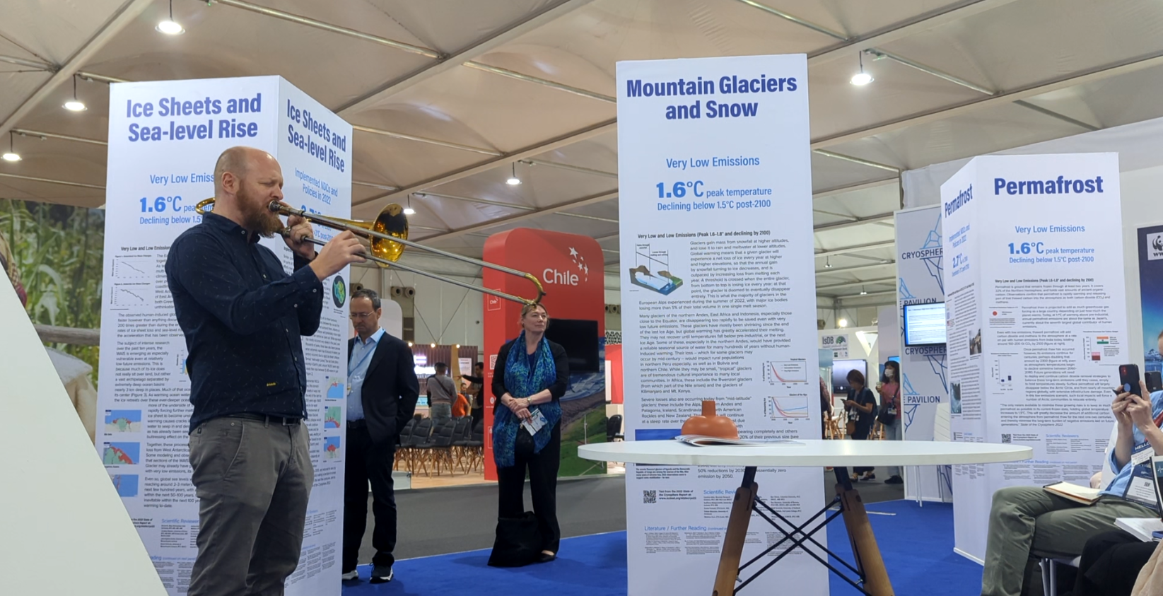
Composer and trombonist Simon Petermann performing in front of the Cryosphere Pavilion’s pillars, as part of a broader piece on glacier loss “Waking the Giants”.

The publication of the Global Carbon Budget 2022 during the conference also felt like a blow to ambition, showing that global CO2 emissions from fossil fuels hit record highs this year. Although “total” emissions remain slightly below the record level set in 2019, this is by dint of land use changes that are probably outside of our control at present. A couple of people approached me at COP citing previous emissions “deadlines” that we have now missed in light of the 2022 budget. Some wanted to conclude that we’re all screwed and should use this as an excuse to give up on the 1.5°C target. Others thought it undermined our messaging that 1.5°C was still geophysically attainable. A third group wanted us to set a new, even more urgent deadline! I wrote a correspondence piece to Nature about this issue, which just came out.

The Cryosphere Pavilion (organised by the ICCI) traditionally has literal “pillars” of the cryosphere, carrying information on systems like permafrost, mountain glaciers, polar ice sheets and Arctic sea ice. Based on this year’s State of the Cryosphere Report, we toppled the Arctic sea ice pillar to recognise the fact that the Arctic Ocean is almost certain to be sea ice free at least once before the end of the century. Early in the conference I spoke at a “dedication” ceremony for the toppled pillar.

Me speaking at the dedication ceremony for the toppled Arctic sea ice pillar (visible on the right).

Finally, the ICCI successfully coordinated the formation of “Ambition on Melting ice”. This is a multinational coalition of 18 countries which aims to bring attention to the special role of the cryosphere in global change. In particular, its aim was to emphasise the near-universal exposure of countries to cryospheric change via sea level rise. In its declaration, the founding governments made clear that the Paris 1.5°C target is essential for the cryosphere, and as such pre-2030 emissions are imperative.

Because of the advocacy above, the cryosphere was mentioned for the first time in a COP cover agreement, in Section 1: “Science and urgency”. In particular, the Parties now formally recognise “the impact of climate change on the cryosphere and the need for further understanding of these impacts, including tipping points”. Recognition from the Parties that our work is important is a big deal for my field, and for me personally! So congratulations and thanks to the ICCI and all those who lobbied for my favourite earth system at COP27.

Excerpt from the “Sharm el-Sheikh Implementation Plan”, also known as the COP cover agreement. It mentions the cryosphere and tipping points for the first time.

The CMIP6 Arctic Processes Camp at Søminestationen, Denmark

In October I headed to Denmark for a ten-day workshop on the results from the latest generation of complex climate models. It was organised by Ruth Mottram and Celine Heuzé, and was specifically focussed on the Arctic. Around twenty-five of us attended, from all disciplines of oceanography, atmospheric science, glaciology, modelling, observations and remote sensing.


The beautiful Søminestationen (sea mine station in Danish), located by the side of a fjord outside of Copenhagen.


Our work on the CMIP6 data (see below) was interspersed with lectures on the Arctic climate system. These included the physics of the atmospheric boundary layer, deep circulation of the Arctic Ocean, and the mass balance of terrestrial ice sheets. We also had talks on more methods-based topics, such as regional climate models, the work of climate services agencies, and the organisation of the CMIP programme. 

On top of these longer form talks, all participants described their work and research interests in 10-15 minute presentations. These were super interesting, spanning stratospheric dynamics to paleo-circulation of the ocean. 

What is CMIP6?

The Intergovernmental Panel on Climate Change (the IPCC) is tasked by governments around the world with telling them what will happen to the world if we follow different carbon emission pathways. To do this, the IPCC calls upon the results of a suite of complex models of Earth’s atmosphere, ocean and ice sheets.

To systematically and fairly examine the outputs of models, it’s important to know how they relate to each other. Individual models are designed differently, so give different “answers” to what will happen if we put a certain amount of carbon into the atmosphere. They have variously complex sub-models for the oceans, for sea ice, and for atmospheric dynamics, which results in various strengths of warming. Various reductions in sea ice. Various shutdowns to the Atlantic circulation. So the IPCC consults models, and presents a spread of answers for each question. Data from the Coupled Model Intercomparison Project (CMIP) contains these answers - we are now on round six of this project. 


Schematic of the Coupled Model Intercomparison Project. The models are intercompared with a variety of metrics and experiments, and their outputs are used to understand variability, predictability, and future climate.


A Science Question

The Arctic is warming at around three to four times the global average rate. As well as lifting the global average rate due to its outsized warming, this amplification also stresses physical and biological systems in the region. But the complex models used by the IPCC do not agree on the future magnitude of this amplification. What might cause this spread?

Recent Arctic amplification in he ERA5 atmospheric reanalysis data set. In these data the Arctic is warming at 3.6x the global average rate.

One reason that models simulate different magnitudes of surface Arctic warming is because they differentially trap energy near the surface rather than radiating it out to space or further up in the atmosphere. In winter the snow surface radiatively cools itself to below the temperature of the air above, creating a temperature inversion. In this scenario, air temperature increases with height in the atmosphere. Inversions create “stable” atmospheric conditions which reduces the upward movement of sensible heat, trapping it at the surface. So… do models with stronger atmospheric inversions have larger Arctic amplification? 


Winter variability of air temperature with height under clear (red) and cloudy (blue) skies at the SHEBA campaign. Figure from Pithan et al., 2014. Temperature initially increases with height - this is called a temperature inversion.


As well as answering the above question regarding Arctic amplification, we might also ask the following: how strong should a model’s temperature version be under a given set of meteorological conditions? To address this, we corralled weather balloon data from three field campaigns: SHEBA, MOSAiC and the Soviet NP stations.We then characterised the strengths of atmospheric inversions that were observed, and compared theses strengths to other, coincident meteorological variables. These observed relationships between inversion strength and surface air temperature, wind speed and cloud cover can then be compared with the CMIP6 models. 

Results?

Actually doing the analysis was difficult, as it required the analysis of 6-hourly data from the models, which is both computationally and memory intensive. Furthermore, not all model runs that contribute to CMIP6 output the 6-hourly data that we wanted to analyse. I’m going to keep our results under my hat for now, because we might press on and write them up fully. But suffice to say that our results were interesting, and hopefully you’ll see them in your favourite journal one day. 

I’d like to thank Ruth Mottram and Celine Heuzé for organising the workshop, and Tina Odaka for organising all the compute-power and teaching us how to use it! My thanks also go to Felix Pithan and Jonny Day, who acted as mentors for our group as we worked, guiding us towards the most interesting and realistically solvable questions.

Group photo on a (presumably decommissioned) torpedo outside the research station, which takes its name from the history of naval weapons development.

Antarctic Pre-Deployment Training

Before you endure Antarctica in winter, you have to learn some stuff. Some of that stuff is what sort of chocolate they have, so you don’t need to bring that kind yourself. Some of the stuff is what to do if somebody sustains a life-changing injury. A mixed bag of vibes. Every year, those who plan to “Go South” that season get their heads together in Cambridge, the home of the British Antarctic Survey. The meeting runs over two weeks and is known as Pre-Deployment Training, or PDT.

Most people who go South do it in the summer, when conditions are most hospitable and the risks are lowest. Their PDT is based entirely in Cambridge. Those who plan to spend the winter in Antarctica spend a few days in Cambridge before heading to the Peak District for camping, team building and specialist instruction from the BAS field guides. At the end of this, the winterers return to Cambridge for a three-day, Antarctica-specific first aid course.

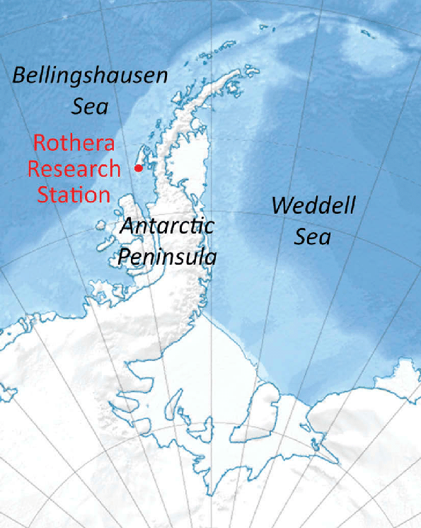
Location of Rothera station in West Antarctica, where Vishnu and I will spend eight months of 2023.

Vishnu Nandan and I will be working with a radar instrument in Antarctica from March - November 2023, as part of large UK project named DEFIANT. I’ll write a dedicated blog post about our field plans soon, but the essential background here is that we’ll be working for the University of Manitoba, but will be hosted by BAS at its base in Rothera in West Antarctica. What follows is my personal view of one part of a large team effort. 

The Start

I picked Vishnu up from the airport and we drove straight to Girton College, Cambridge where our base would be for the next two weeks. After unpacking in our single, 80’s style college rooms (a bit nostalgic for me!), we showed up to a huge dinner with all the PDT participants - perhaps 200. So began three days of new faces and names.

Several days of talks began the following day at BAS, a fifteen minute walk away from Girton. The talks and activities were broadly split into three categories: health and safety (manual handling, fire extinguisher training, risk assessments), workplace culture (equality, diversity and inclusion, managing interpersonal relationships on base, BAS corporate culture), and technical/informational items (about BAS, Rothera, operational and environmental protocols in Antarctica). We also managed to sort out a meeting with the BAS logistics team to discuss shipping, which was super useful. 

Vishnu practising with a fire extinguisher

Vishnu and I also squeezed in our kitting appointments, where we were outfitted with all the warm clothing one could ever need for Antarctic winter. This was a very impressive experience in terms of the expertise of the staff, the thought that went into the clothing choices, and the quality of the equipment itself. Our kit is now travelling to Antarctica aboard the new UK polar ship the Sir David Attenborough, along with a big box and a big bag each full of our personal effects.

The Middle

After four days of talks the winterers piled into a bus and left for the Peak District. There we met our field guides, but also finally became fully acquainted with those who would be wintering with us. This is an important distinction - at its peak in summer there can be 150 people at Rothera, whereas between 20 and 30 will stay over winter when Vishnu and I will be there. 

We got to know our wintering team with team building exercises, which included pitching the BAS traditional tents, learning to ascend and descend ropes in a crevasse rescue scenario, doing map-and-compass navigation exercises, and learning to light kerosene stoves and lamps. In the evenings we cooked for the team in small groups before heading to the pub. 

At the end of our Winter Teams Training, we spent a day doing some scenario-based training for “Major Incidents”, which are defined as events which critically compromise the functioning of the base. These are typically multi-person search-and-rescue scenarios, large fires, and major medical incidents. This was super interesting, but also really brought home the seriousness of life in Antarctic winter. 

Top left: pitching and exploring one of the famous BAS pyramid tents. Top right: Rosemary, the wintering doctor, practices ascending ropes. Bottom left: Vishnu abseiling Bottom right: me, struggling slightly to switch from descending mode to ascending mode.

The End

After our adventure in the Peak District we rejoined the PDT for three days of fairly gruesome first aid. This course is run by the British Antarctic Survey’s Medical Unit (BASMU), which is probably a blog post in itself. BASMU is made up of a wide variety of doctors, nurses and paramedics who have had specific training and experience in challenging environments like Antarctica. I’ve probably done six or seven first aid courses before, both basic and advanced, but this one was easily the most interesting. 

The course was done in two parts: one was a series of around 20 “bases” that we rotated around over the three days. Typical topics were: anaphylaxis, squirting bleeds, stretching with spinal injuries, very strong painkillers, cavity wounds, splinting broken bones, and treating serious burns. Particular highlights of this for me were the both hilarious and horrifying painkillers on offer (fentanyl lozenges?!), treating prop limbs and organs that would squirt fake blood at you, and treating real doctors that would run around screaming.

The other part of the training was lecture-based, although “lecture” is an unfairly boring word for what happened. We sat in a theatre (with a stage), and were given talks on topics such as cold-injuries, sepsis, mental health in Antarctica, and those “major incidents” again. One highlight was what could only be described as a sketch-show, put on by BASMU staff to recap the previous material from the bases. 

Top left: practising with a defibrilating machine. Top right: learning how to manually ventilate a casualty. Bottom left: a vacuum splint that goes rock solid around a would when its air is removed. Bottom right: trying to roll a casualty without twisting the neck or spine.

Post-Course and Pre-Campaign

Since the course the wintering team has had a pretty active whatsapp chat that’s helped us bond a bit more, and swap vital information. Even though Vishnu and I will head out in March, most of the team is already there. Their BAS contracts generally include the summer, the winter and the following summer. That creates a sustainable cycle where you can learn the ropes from your predecessor your first summer, and pass the baton to your successor the following summer. Dropping in for just the winter seems to be pretty uncommon, so there may well be a few corner-case administrative hurdles for us to jump yet. 

Seeing so many amazing pictures of Rothera in the Whatsapp chat is inspiring, frustrating, and makes me extremely jealous. Before they headed South, some of our fellow winterers also undertook training for advanced roles. This included qualifying to work at heights, do more advanced and invasive first aid, fight fires, and assist in emergency recompression for divers. 

Since PDT Vishnu and I have had the less glamorous tasks of handling challenges involving international shipping, although Vishnu has taken the lead on most of it as I’ve been focussing on finishing my PhD. Our shiny new laser-scanner, a self measuring snow probe, the radar sled, a snow-pit kit, an ice coring set and other miscellaneous instruments are now on their way to Antarctica aboard British polar ship. The University of Manitoba radar (“KuKa”), a snow-micropenetrometer (an “SMP”) and a snow microstructure reflectometer (an “InfraSnow”) will meet the ship in Punta Arenas via airfreight. All that’s left for me is to pass a suite of medical and dental checks and to start my new contract at the University of Manitoba in January. Oh… and to finalise the science plan!

Challenges to the retrieval of sea ice thickness in Antarctica with CryoSat-2 and Envisat

I’ve recently seen discussion about applying the tried and tested methods of Arctic radar altimetry to Antarctica. Of course, people have already done this with mixed results (e.g. Schwegmann et al., 2016; Kacimi and Kwok, 2020), but I think people might now fancy making a product (in addition to the ESA CCI one which isn’t updated). Radar-based sea ice thickness products for the Arctic have a long history, but generally rely on the assumption of total radar penetration of the overlying snow. This is a really important assumption, that I don’t think is portable to Antarctica.

The basic idea underpinning most radar-satellite retrievals of sea ice thickness is that Ku-band radar waves emitted from altimeters on EnviSat and CryoSat-2 penetrate a dry, cold snowpack and return to the detector after bouncing off the ice surface. By working out how far the ice is sticking out of the water, we can estimate sea ice thickness.

What are the challenges in Antarctica?

There are a couple of things about Antarctica that mean this may not work consistently there. They mostly have to do with there being a lot more snow on Antarctic sea ice. Some sources put Antarctic snowfall at three times more than the Arctic (Holland et al., 2021). This is for a few reasons: the ice drifts more freely allowing leads to open up, and it’s surrounded by the Southern Ocean which means moisture transport is more abundant. This produces a number of asymmetries by comparison to the Arctic:

The ice freeboard is sometimes (often?) zero or sub-zero

The snow is sometimes so deep and heavy that it pushes the sea ice to the waterline and even below it. When that happens, we can’t convert a freeboard measurement into thickness. For observations and descriptions of zero or negative freeboard see Wever et al. 2021, Perovich et al. 2004, Lange et al. 1990, Weissling et al., 2011, Nicolaus et al., 2009, Massom et al.. 1997, Eicken et al. 1995, and Ozsoy-Cicek et al. (2013). It’s worth saying that there’s also an observational bias, where ice camps and helicopter landings are much more feasible and safe on thicker ice with larger freeboards. So observational experience would lead you to underestimate the prevalence of zero freeboards.

Brine wicking blocks radar waves

Figure and caption from WIllatt et al., 2010. Shows brine wicking and negative freeboard.

Because of the larger weight of snow, when the sea ice surface is submerged the overlying snowpack can flood. This can cause brine to wick up into it. Basic electromagnetic theory tells us that radar waves from satellite altimeters can’t penetrate brine wetted snow – as such, we can’t measure the height of the ice surface. The radar waves just don’t make it. This isn’t so much because of the salt scattering the radar waves itself, but because the presence of salt means liquid water can exist in the snowpack at temperatures well below zero. Snow wetness above 1% is generally considered to be a show-stopper. Brine-wetted snow is again often observed in the Antarctic, although its prevalence is hard to quantify (Wever et al. 2021; Willatt et al., 2010; Rapley and Lytle, 1998; Massom et al., 1998; Massom et al., 2001).

Figure and caption from Massom et al., 2001

However, a lack of understanding of this might make you think that you’re taking a real sea ice freeboard measurement. Because brine can travel up fairly high in the snow and freeze there to form snow-ice, and your ice freeboard is typically low, you may retrieve radar freeboards that look normal by Arctic standards. Even though the radar waves that return to your detector have not returned from the ice surface.

However, there are some areas such as the Weddell Sea where the sea ice is thicker, so less prone to negative freeboards and brine wicking. Here we have a separate issue:

Snow Metamorphism

A core of some snow on Antarctic sea ice (my photo). There’s a continuum from large-grained, icy, highly scattering snow to basically clear superimposed ice at the base.

Snow in Antarctica often doesn’t all melt away in summer (Andreas and Ackley, 1982). I recently encountered this in the Weddell Sea, where we found a thick layer of icy snow, and superimposed fresh ice at the base of the snow left over from the previous year.

When snow is “left lying around” over the summer, it becomes impenetrable to Ku-band radar waves – the snow I saw was impenetrable to even a knife. That's because its grains undergo metamorphosis, and become extremely large (see top of core in picture). And any surface melting percolates down to the bottom of the snow and refreezes in a layer of superimposed ice (see bottom of core in picture).

Again, if your radar waves encounter a large-grained snow layer, or a superimposed ice layer like this, they’re very likely to scatter back to your detector before reaching the sea ice. This might make you think that you’re measuring the sea ice surface, but actually you’re just measuring the height of the surface of last summer’s snow. This might help you retrieve a “sensible” value, but it won’t actually represent the sea ice thickness.

What we need

In order to actually believe an Antarctic SIT product, I would like to see three things:

Sea ice thickness data should meaningfully incorporate radar data.

I’d like to see that the radar freeboards actually impact the sea ice thickness figure. Some sea ice thickness retrievals in Antarctica have used the “zero freeboard” assumption (e.g. Kurtz and Markus, 2012), and estimate sea ice thickness assuming the ice surface is always at the waterline. This works much better for laser-altimetry than radar. With radar, your SIT is entirely determined by how much weight of snow is assumed to be sitting on the ice and the ice density, rather than your very low CS2 freeboard measurement.

Because there’s a seasonal evolution in the amount of snow that’s assumed to be on the ice, this imparts a seasonal evolution in the sea ice thickness – all without a radar measurement. This means that we’re not really using radar to retrieve the thickness at all, unless we’re using radars to calculate the weight of snow. Which takes me onto my next point:

A decent and interannually varying snow cover product

Ku-band radar waves often don’t reach the Antarctic sea ice surface in my opinion, which is sometimes below the waterline anyway. This makes it much harder to use “dual-frequency” methods of snow depth estimation than in the Arctic. It’s tempting to just take the ranging differences between CryoSat-2 and AltiKa as the snow depth and argue that it matches Operation Ice Bridge snow measurements. There are two potential problems with this: Firstly, to do that you should evaluate against an OIB product that’s not systematically biased low by sidelobes (like the NSIDC quicklook product). Garnier et al. (2021) did this, and it makes sense that their low snow depths from underpenetration of CryoSat match the low snow depths of the quicklook-OIB product which originate from sidelobes (Kwok and Haas, 2015, Kwok et al., 2017, Webster et al., 2014). Secondly, OIB snow depths are a radar product, so as well as sidelobes they’ll suffer from very similar underpenetration biases as the satellite-altimeters when it comes to brine wicking. This would lead to false agreement and artifically good evaluation against a dual-frequency product.

To fully capture the interannual variability and trends, we’ll also need to develop an interannually varying snow product (I wrote a paper about the drawbacks of snow climatologies in the Arctic here). See Steer et al. (2016) for how much snow depths in East Antarctica varied from year to year.

Evaluation against thickness data (not freeboard data) over several years (not just replicating the seasonal cycle)

I’ve already mentioned the issues with evaluating a satellite radar product with an airborne radar product (OIB). What really needs to be done is the final thickness product needs to be evaluated against an independent thickness (or draft) product such as that from upward looking sonar buoys.

Furthermore, any new thickness product should be required to outperform a seasonally evolving climatology. It’s easy to get the seasonal cycle of sea ice thickness from climatologically accumulating snow and assuming that it’s hiding more and more ice over the winter. What will really indicate whether a sea ice thickness product is “working” is whether it captures year-to-year variability in measured thickness or draft – not the seasonal cycle.

Biogeochemistry on ice in the Canadian Arctic

In May I attended the BEPSII biogeochemistry sea ice school in Cambridge Bay, Nunavut, Canada. I was particularly interested to visit the sea ice at that time of year as we were about to experience the melt onset: the transition of the sea ice’s snow cover from dry to wet. I’m currently writing the final chapter of my PhD thesis on the topic of melt onset, so seeing it in person was really thought provoking. I also recently developed a floe-scale snow-depth distribution, and I was keen to model its impact on light availability in the period prior to melt onset. Finally, next year I’m planning to take some chlorophyll profiles and under-ice light measurements from landfast Antarctic sea ice, so I wanted to learn how to do this from the best.


Me looking at the ice surface that was gradually revealed over the week as the snow melted back. The ice surface was very fresh, as a result of nearby river. This fresh-ice cap overlay the more traditional, highly saline sea ice. Photo Evelyn Workman (BAS) (@efworkman96)


BEPSII (BGC exchange processes at the sea-ice interfaces) is a group of scientists that work on just that. In particular, they focus on improving observations of BGC processes, building large-scale databases of BGC data, and upscaling and incorporating processes in models. BEPSII organised a ten day field-school, where we received classes in the mornings and went out onto the nearby sea ice in the afternoons. As well as receiving the wisdom of established scientists, the students also spent time networking with and teaching each other.

What is BGC about?

Brine channels (white dots) are visible in a cross section of a sea ice core. These channels allow the vertical flow of gas and nutrients through the ice. They also allow the ice to desalinate over time through brine convection. Photo Georges Kanaan (UW) (@scientificgeo)

Sea ice is a three phase material: it’s made of liquid saltwater, solid ice crystals, and gas bubbles. The relative abundance of those three components dictates its porosity, temperature profile, thermal conductivity, bulk density and its ability to be penetrated by light. The same can also be said for the snow that sits on top! Much of the early teaching-sessions of the course focussed on how to understand the relationships between the physical sea ice variables above.

A separate but related strand of teaching focussed on in-ice algae: how, where and when it grows, and what its effect is on the organisms that depend on it. In-ice algae only makes up a relatively small fraction of Arctic Ocean primary productivity (relative to floating phytoplankton), but it provides a key service because of the timing of its bloom. It can bloom earlier than phytoplankton because it can sustain a position at the ocean surface by dint of being locked in the ice. This means it can sustain grazers that have survived the winter before they can live on phytoplankton.

The final strand (in my subjective subdivision) involved nutrient cycling and gas exchange. Because the polar oceans are relatively cold, they act as excellent solvents for carbon dioxide and nutrients like nitrogen. They also store these materials and nutrients as particulates in suspension. The ocean is full of stuff! However sea ice moderates the cycling of these nutrients and the flux of carbon. That’s because the nutrients are modified by organisms that respond strongly to light, and thus respond strongly to sea ice cover. Sea ice also acts as a porous “cap” on the ocean, that selectively blocks (or even amplifies!) gas exhcnage between the ocean and the atmosphere. This function is in large part determined by the connectivity and abundance of its brine and gas inclusions that I mentioned above.


Odile Crabeck and Bruno Delille leading brine sampling with a peristaltic pump. When a ‘sack hole’ is drilled part-way through the ice, it fills with brine which seeps in due to ice porosity. This can be pumped out into bottles using a pump.


Going on the sea ice

Our accommodation was right next to the sea ice, so we were able to go out and walk around on it almost every day, with the added benefit of 24/7 daylight. In the afternoons we went out with the lecturers and scientific equipment. To measure the brine volume fractions we drilled sea ice cores and then immediately measured their temperature profiles. We then sawed up the cores in 5 cm segments, and melted them back in the lab. We then measured the bulk salinity of these samples. Knowing the bulk salinity and the temperature profiles allowed us to model the brine volume fraction and the salinity of the brine inclusions. We also spent time measuring the optical properties of the snow and sea ice. This involves using a radiometer to measure the incoming sunlight, the sunlight reflected from the ice, and then positioning the radiometer under the ice and measuring the amount of light that penetrated through.

Overall I spent twelve days in Cambridge Bay and had a great time. I learned a lot about BGC and it was super-interesting to see melt onset occur in person. It was also really cool to learn about everyone else’s projects; I’m sure we’ll collaborate some day. I’m grateful to IASC for paying for my participation, and for BEPSII for organising the school. But especially I’m thankful to all the lecturers who often took time out of their actual fieldwork campaign to teach us both in the classroom and the field.

One rider in the snowmobile races, which are part of the annual Frolics Week in Cambridge Bay. We were lucky that the BEPSII school coincided with this week! This race was a time trial, but there were also head-to-head drag races and a hill climb event.

Antarctic Fieldwork with a CRISTAL-band Radar

Background

By comparison to measuring area coverage, measuring the thickness of floating sea ice with satellites is extremely hard. The traditional way of doing it is to bounce radar-waves off the ice surface, and time their return. However this technique relies on radar waves (in the “Ku-band”) penetrating any overlying snow cover. Another technique uses a higher frequency of radar-waves (“Ka-band”), which are assumed to bounce off the snow surface. In both cases, the assumption of either total or negligible snow penetration by the radar-waves is key to accurate measurement of the sea ice.

One of ESA’s next-generation satellite missions (CRISTAL) aims to use the differences in these two frequencies to measure the snow depth itself. By assuming the Ku-band radar waves penetrate the snow, and Ka-band radar waves bounce off the top, the difference in the timings of the returns will theoretically give the snow depth. Retrieving snow depth over sea ice is a formal mission requirement of CRISTAL, with an ‘uncertainty goal’ of of 5 cm.

Uncertainties in Radar Penetration of Snow

However, there is evidence that Ku-band radar-waves sometimes do not reach the ice surface as intended, and Ka-band radar-waves sometimes unintendedly penetrate the snow. Reasons for this include the presence of stratigraphic-layering in the snow and the presence of brine in the snow. One satellite-based study suggested that Ka-band radar waves from the AltiKa satellite were scattered from ~45% down into the snowpack, whereas Ku-band waves from CryoSat-2 only penetrated 82%. A recent publication indicated that Ka-band radar waves emitted from an aircraft scattered from further away than Ku-band waves for part of the flight. Another airborne-based study also indicated that the ‘main scattering surface’ for Ku-band radar waves was closer to the top of the snow than the bottom.

Fieldwork!

Jeremy Wilkinson (BAS) and I digging a snow pit. A tabular iceberg can be seen on the left-horizon. Photo by Timo Hecken, German Heliservice.

If CRISTAL is to be a full success over sea ice, we need to better understand when our assumptions of full/negligible radar-wave penetration are true, and when they fail. Improving this understanding is part of a recently-funded NERC project named DEFIANT. I was lucky to lead the radar-physics component of the first DEFIANT field campaign in the Weddell Sea of Antarctica, where we measured radar penetration depths from snow covered sea ice. We did this using a sled-mounted radar which worked in both the Ku- and Ka-bands. The radar has a much higher range resolution than satellites, and so allows us to look at where most radar waves return from as a function of height (with ~2cm resolution). Our field campaign took place over two months in March and April, where we worked from the German research vessel Polarstern as it broke through the marginal ice zone near the edge of the pack. Here we encountered recently formed sea ice that was generally too thin to walk/land on, interspersed with thicker ice floes that had survived the summer melting season.

The radar instrument stands next to us while we dig a snowpit over rough sea ice. Photo Timo Hecken, German Heliservice.

We generally visited the sea ice floes by helicopter. This involved taking apart the radar each day and strapping it to its sled for transport, then reassembling it at the field site. This was a pretty stressful experience, as the radar is extremely fragile. The sled and radar fit in the back of the helicopter with around 2cm to spare! Selecting a floe was pretty difficult; as soon as we landed we would drill the floe to mesaure its rough thickness, in part to check it was safe to depower the helicopter there. Floes were often much thicker or thinner than we guessed from the air.

Because of the terrible weather that we encountered throughout the campaign, we were only able to do radar work on five days. We managed to dig seventeen snow pits on five floes, each of which we scanned with the radar at both frequencies. In our snow pits we measured (where possible) snow temperature, hardness and density profiles. We also mapped the stratigraphy (layering structure), took photographs and made other more general observations of the snow condition.

The floe that supported us on the final day. By this point we were drifting freely and the floe was rotating and moving relative to its neighbours. Photo Timo Hecken, German Heliservice.

What We Saw

The snow that we found on our campaign had an idiosyncratic character: we consistently observed an underlying layer of remnant snow that was present during the summer, and an overlying layer of snow that had been deposited in the “cold season” which had started a few weeks prior. The remnant snow layer had been heavily modified by the summer weather: the grains were large and so well bonded that it was mostly impossible to dig. At times it had undergone so much melting that there was a thick layer of solid, freshwater ice near the bottom (see photo below). This begged the question of what was really snow and what was ice? On top, the snow that had been deposited recently was much more like the snow that we encounter in Europe or the contiguous USA: softer, lighter, diggable with a shovel. Both layers (‘cold season’ and ‘remnant’) had internal stratigraphy: hard layers, soft layers, and transitions. On one occasion we encountered a striking ice lens within the snow (see photo below).

So what were the results? Did Ku-band radar waves penetrate to the sea ice surface? Did Ka-band radar waves just bounce off the top of the snow? There are a lot of people with a stake in this data, so I can’t share the full story on my website right now. But the story of Ku/Ka interaction with snow is clearly a lot more complicated than full/negligible penetration.

We’ll continue to work on the radar and snow data over the next few months at CPOM, but for now I’m really grateful for the support of Jeremy Wilkinson and Povl Abrahamsen (both from BAS) while in the field. They’re both hugely experienced and were incredibly supportive of me while we were down south. Without them I’d have been lost! And I’m also grateful to my supervisor Julienne Stroeve for backing me to go – KuKa is both expensive and fragile, so entrusting it to a PhD student was a bit of a leap of faith. It’s also really cool that such a large NERC project can involve students like me! On that note I’ll also be on DEFIANT’s next bit of fieldwork next year: overwintering on the Antarctic peninsula with the same instrument. Probably another blog post for that though...

Churchill Sea Ice Field Campaign

Position of Churchill on a map of Canada

At the end of November I flew to Churchill (on the Hudson Bay, Canada) to participate in a two week sea ice campaign. We planned to spend two weeks conducting radar and snow-science experiments on the sea ice, staying on land and commuting to the ice each day. But at the time of flying out, the region was experiencing a record late freeze-up and it looked a lot like the ice would be dangerously thin, making research impossible.

Despite the bad start, a miraculous cold spell meant that we could access the ice after waiting a few days for it to thicken. We spent these days testing out our instrument (a sled-mounted radar) on nearby frozen lakes. Because lakes are filled with fresh water which has a higher freezing point than salty sea water, they freeze earlier and easier.

Our foray into lake-ice-science turned out to be a fascinating experience: we found that our radar waves penetrated considerably deeper into the ice, revealing the top surface as well as the bottom. This allowed the estimation of ice thickness. By contrast, radar waves are rapidly extinguished by salty sea ice, making the bottom of the ice invisible to our instrument. The bottom surface of the lake ice was so visible and well imaged that we were able to guess about whether it was stuck to the lake bed (“grounded” ice), or whether it had water below it. Later in our campaign we attempted to identify a lake that would be entirely frozen to the bottom using satellite imagery; we then scanned it comprehensively with the radar. We hope that this will produce a map of the lake depth.

John Yackel rides the (switched-off) radar as we traverse a frozen lake.

Once the sea ice had thickened enough to be safe, we began doing science on it. After an exploratory visit, we took our radar and started to scan it. Immediately we noticed that the ice surface was extremely rough, as tidal forces and shallow water had broken and turned the ice floes over before they joined together. For every visit we travelled several kilometres to the sea ice over tundra and frozen lakes - an awe inspiring experience when your goggles aren’t frozen over!

The main science goal was to take radar measurements of the snow on the sea ice, while simultaneously measuring the depth and physical properties of the same snow with other instruments. Doing this on recently formed ice fills a knowledge gap, as the radar instrument has only previously been deployed on older ice during the MOSAiC expedition. Newly formed ice is saltier than older ice, so much so that it makes the snow above salty as well. Salty snow is theoretically less penetrable by radar waves - but how much less?

Vishnu Nandan and John Yackel dig a snow pit.

To answer our questions about how radar waves interact with snow on young ice, we dug “snow pits” throughout the campaign. This involves cutting a cross section through the snow with a shovel, and sampling the snow’s density, salinity and temperature vertically. The first is measured with a “density cutter”, which removes a known volume of snow that can then be bagged, melted, and later weighed. To measure the salinity of the snow sample, we measure the conductivity of the melted snow. Saliter snow is a better conductor of electricity, so when a higher current flows, we infer saliter snow. Finally, we measure the snow temperature in the field with a temperature probe (a bit like a kitchen meat thermometer). We hope that all these measurements will tell us about what drives greater and smaller radar reflection from the snow.

Rosie Willatt about to sample some very dense snow over lake ice.

Overall the fieldwork was a big success, not least due to our palatial field station and excellent guide, Brian Gulick. Brian is a Churchill local and seemed to have the solution to every problem, regularly fixing snowmobiles and even our science equipment in the field, in tough conditions with few tools. He combined his technical knowhow with a professionalism that made us always feel safe and empowered to do science. As for our field station itself, it was equipped with twenty rooms, each with four beds. But our nine person team was the only booking, so we had lots of space to both work and relax. As well as having a lab, garage, kitchen and two classrooms, the station also had a gym, rec room, and “aurora dome”. This was a large perspex dome-shaped room on the roof of the station: it allowed three or four people panoramic and cozy views of the Northern lights. We took full advantage of the dome when it was too cold to use the balconies. 

Having a comfortable base was really important because we were limited in our ability to leave the station. Daylight temperatures often dropped below -20, getting down to -29 on our coldest working day. To add to this, the risk of polar bears was always present: we carried a gun whenever we left on foot. Now the hard yards begin at the desk, analysing and collating the data we gathered. While that’s considerably less glamorous, it can mercifully be done with a warm coffee in hand.

The team, from left to right: Tom Newman, David Jensen, Brian Gulick, John Yackel, Julienne Stroeve, Erica Rosenblum, Vishnu Nandan, Monojit Saha, Rosie Willatt, Robbie Mallett

The COP26 Cryosphere Pavilion

UCL is an official “Observer Institution” to the UN conferences on climate change, and sent a delegation to this year’s COP26 in Glasgow. I was lucky to be chosen as a delegate based on my recent research into sea ice thinning in the North East passage of the Arctic Ocean. At the conference I helped to run the Cryosphere Pavillion, which functioned as a hub for discourse and action on the earth’s fastest changing natural system.

There are lots of different activities at COP26: politicians posture, they negotiate, and they also listen. Much of the posturing and negotiating is done on two large stages and a number of back rooms. But in between these sessions, policymakers often retire to a conference hall full of “pavilions”, where they listen to experts. These are essentially a series of around 100 three sided rooms, which represent the interests of countries and large organisations such as the world bank and the WWF. This year more abstract things had their own pavilions, such as methane, wind power, and forests. Because the 2019 COP25 was originally organised in Chile (which relies on dwindling mountain glaciers), a Cryosphere Pavillion was established. And although this was slightly incongruous when the conference was then moved to Madrid, the pavilion was such a success that it continued at COP26.

My role at the cryosphere pavillion switched between managing invited speakers, helping the audience navigate our silent-disco-style headphones, and engaging with passers by on cryospheric change. COP is organised by the UN, which is constituted of nation states; this can lead to the cryosphere being neglected because Antarctica and the Arctic Ocean largely fall outside national boundaries. As well as helping with the running of the pavilion, I also had the opportunity to give two talks - one on sea ice and permafrost, and the other on IPCC model projections of sea ice decline. 

Overall, I came away with mixed feelings about the process. I sometimes felt that we, as scientists, weren’t fully connecting with our target audience. But I also sensed that this year was the first year that the science was accepted by the policy and political communities, and scientists were there to inform rather than to argue. Perhaps the word “unequivocal” in the headline of this year’s IPCC report contributed to this. I also feel like my experiences at COP may be of increasing benefit throughout my career, as my work may turn to face policy questions more than scientific ones. In any case, I left extremely grateful for the contacts and friends I made, and for the insight into how science translates into policymaking.

A dual-frequency radar on the MOSAiC ice floe

It’s cold near the poles where the sea ice forms, which makes it difficult and dangerous to monitor the rapid environmental changes that are happening. The ice is also dark to look at during the winter polar night, so satellite-mounted cameras are of limited use. It’s also often cloudy which can block satellite-mounted lasers that actively illuminate the surface. In response to these challenges, satellite-mounted, cloud-penetrating radar systems are a popular way of monitoring the sea ice cover. 

CryoSat-2 monitors Arctic sea ice thickness in the polar winter, even through clouds.

CryoSat-2 monitors Arctic sea ice thickness in the polar winter, even through clouds.

In a similar way to how the components of white light bounce differently off objects to give them color, different radar frequencies bounce off objects differently too. Sea ice is typically monitored using satellite-radars ranging in wavelength from a couple of centimeters (very similar to the energy in a microwave oven) to a few mm (the same frequency used by 5G internet and Iridium phones). Two particular radar frequencies (sometimes called bands¹) used in recent satellite missions are termed ‘Ku and Ka’ bands. The ‘K’ stands for Kurz (German for short), and the ‘a’ and ‘u’ suffixes stand for ‘above’ and ‘under’: Ka is around twice the frequency of Ku. 

The same sea ice viewed at different radar frequencies (from Howell et al., 2018). Different images are obtained from viewing the same scene in different frequency bands. Some sea ice movement has occurred between the two satellite overpasses.

The same sea ice viewed at different radar frequencies (from Howell et al., 2018). Different images are obtained from viewing the same scene in different frequency bands. Some sea ice movement has occurred between the two satellite overpasses.

In winter, sea ice is covered in snow, which presents itself to radar differently to Ka and Ku-band radar waves. How differently? It’s tough to say. We can’t easily work it out from satellites because they have different orbital configurations, operating modes and antenna patterns. That is to say, we never look at *exactly* the same patch of sea ice in *exactly* the same way in both bands. It’s only by doing this that we can isolate the role of the radar frequency.

The KuKa radar instrument was capable of viewing the snow at a variety of angles (scatterometer mode). It was also capable of ‘staring’ down at the snow while being towed along by a snowmobile. Photographs from Stefan Hendricks, displayed in Stroeve…

The KuKa radar instrument was capable of viewing the snow at a variety of angles (scatterometer mode). It was also capable of ‘staring’ down at the snow while being towed along by a snowmobile. Photographs from Stefan Hendricks, displayed in Stroeve et al. (2020; The Cryosphere).

That’s why a dual-frequency radar machine was deployed on the sea ice during the MOSAiC expedition last year by Julienne Stroeve (my PhD supervisor) and Vishnu Nandan. Details of the instrument and the deployment were published in The Cryosphere this week, along with some early results. Because the machine looks at the same snow and ice at both frequencies with (almost²) the same settings, any differences in what the machine sees can be attributed to the different frequencies.

The MOSAiC Expedition also provided the ideal framework for continuous monitoring of the snow and sea ice at both frequencies. A vast array of other physical data was taken alongside the radar measurements like temperature profiles, snow stratigraphy and microstructure characterisation, and laser scans of the snow surface. This means that changes in how the snow looks to the radar can be related back to its changing physical properties. As well as contextual physical data, information from several other ‘remote sensing’ instruments that were also deployed on the ice will ultimately be compared to data from the KuKa radar.

As well as better understanding the correspondence between measurements of existing Ku- and Ka-band satellite missions (e.g. CryoSat-2 and AltiKa), these measurements also help lay the groundwork for the CRISTAL mission. This is a proposed ‘next generation’ satellite mission that will carry both Ku- and Ka-band instruments, potentially launching in 2027.

¹ satellite radars don’t actually operate at one frequency, but instead over a small, continuous range of frequencies. That’s what a frequency band actually is.

² the two radar instruments have slightly different beam widths, so one footprint is slightly larger than the other. The radar footprints are also not exactly overlapping.