I’m in the business of finding physical relationships between stuff. People often ask me what I do exactly, and there are many answers: go to conferences, write papers, make computer code, dig snowpits, submit grant proposals etc. But at the core, my job is to establish how different variables in our world are changing over time, and how they influence each other. I have a PhD in this pursuit, in the context of polar sea ice.
So I was surprised to discover that until last Friday, I had seriously misunderstood the behaviour of one of my most critical tools: the least-squares linear regression. My understanding has always worked as follows: you spot what looks like a linear relationship, open the python arsenal, and point the scipy.stats.linregress gun at a bunch of paired values (often termed “x” and “y” values) and it tries lots of different lines and minimises the residual errors of the lines, to produce a final “line of best fit” - this is your best guess at an underlying linear relationship between the x and y values. I had also assumed that the gradient of the line of best fit linking the x values to their paired y values was the inverse of the line of best fit linking the y values to the x values. I was wrong on both counts.
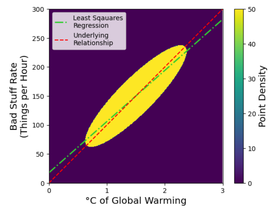
Here is a really excellent demonstration of why I was wrong (sources & credit at end of post). Consider a noisy dataset of many paired x and y values linking bad stuff to global warming. I’ve made this synthetically, by creating an ellipse of data along the line y = x. I’ve drawn a red line along the ellipse to indicate its major axis, which is the underlying relationship that it represents. I’ve then blurred it out using a 2D Gaussian filter, to make it more realistic of the environmental data we typically encounter.
Schematic showing how I constructed my synthetic data, by making an ellipse of values on a background of zeros (see source material at bottom), and then blurring it with a Gaussian filter.
I think it’s pretty clear that the red line still represents the underlying relationship even after blurring. We know the underlying relationship can be described by an additional 100 bad things per hour per degree of global warming, because we made the data!
Presented with the sort of data pattern above, my first instinct is to characterise what looks to be a pretty linear relationship. As a Python user, my go-to tool for this is the scipy.stats.linregress function. Let’s see what happens:

Illustration of how the underlying relationship (red line) is not well represented by the least squares regression line.
Bonkers! The line is clearly at the wrong angle, is not the line of best fit, and doesn’t describe the underlying data. Perhaps more worryingly, you might say (as many often do):
“Robbie, you’ve misunderstood the causal relationship here. It’s actually the bad stuff that’s causing global warming, not the other way around! So you should plot the warming on the y axis, and the bad stuff rate on the x axis, and plot that relationship!”
Let’s do that:

Similar to figure above, but with axes flipped: the gradient of the new LSR line is not the inverse of the previous one, as I had expected.
Oh dear - things are getting worse. You would think that if you flipped the axes, the regression line would flip too, right? At least it should do, if it’s the “line of best fit”.
You’ve probably twigged by now that the least-squares regression line produced by scipy.stats.linregress is not actually the line of best fit, and indeed it treats your y values quite differently from your x values. This is because it is programmed to produce a line that minimises the y-residuals, i.e. the distance along the y-axis between each point and the proposed line. This does not actually make a line of best fit, but instead does whatever it takes to optimise this singular metric - a statistical version of Goodhart’s Law.
Even more alarmingly, the degree to which the least-squares regression underestimates the underlying relationship depends on both the gradient of the underlying relationship, but also tightness of the relationship in your sample data. In the multiplot below, the middle figure shows what happens when I tilt the elipse upwards, i.e. increase the gradient of the underlying relationship. The gradient of the least squares regression line goes down in response! The final panel below shows what happens if I fit the regression line before the blurring - the slope of the least squares regression line goes up in response to the noise reduction.


So how to solve this? What we’d really like is a best fit line that treats x and y values the same. One algorithm that does this is the orthogonal distance regression (ODR). Rather than calculating and then minimising the residuals along the y-axis, it calculates and minimises them in the distance perpendicular to the proposed line. It captures the underlying relationship of the data no matter how the axes are orientated.

Results of the orthogonal distance regression (scipy.odr) - it matches the underlying relationship.
Sources
My sources for this post were the cover of David Freedman’s “Statistical Models, Theory and Practice”, as well as this Stack Exchange post, and this Reddit post on the phenomenon.
